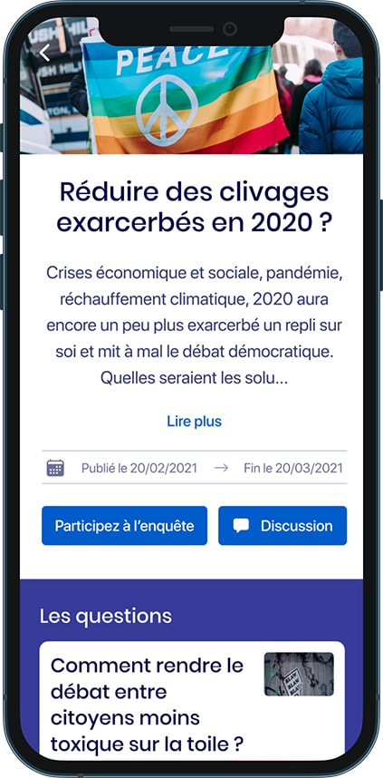
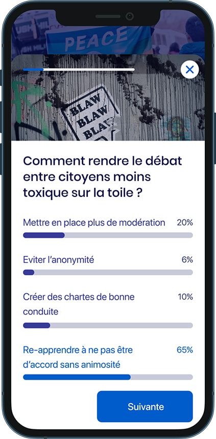
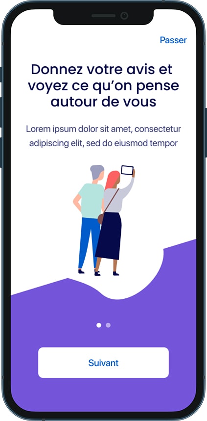
Pepio
A survey app and its complete use case
Knowing what your citizens are thinking.
A startup from A to Z
I guess Pepio was the kind of project that is really interesting. The agency created a MVP a year earlier that had no design nor strategy. We decided to take this MVP and to think it through. From branding strategy to product design, everything was done by a small team of 5 people. I was the sole designer on the project. I can't say that everything was done by the book but I guess we can say that we were pretty agile.
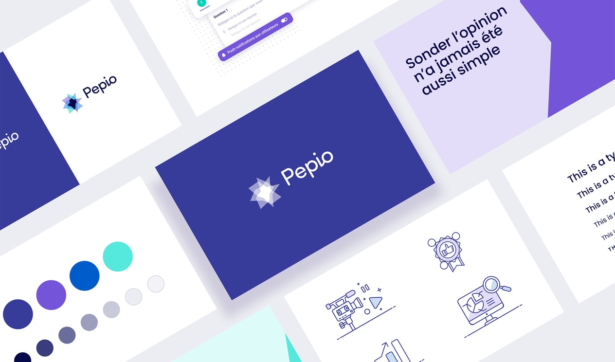

Something rigorous but human
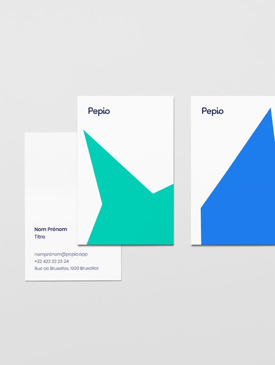
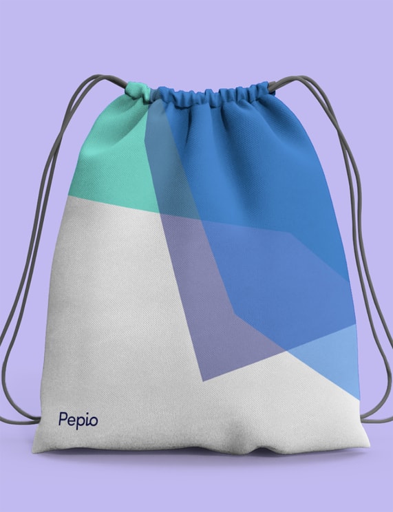
Once the name was found - not an easy task I'm telling you - we needed to create the whole branding. What does this product need to convey? Since this was more than a simple survey app we needed to highlight the statistical part of it. This was rendered by the symbol. However the wordmark is using a more open and humain typeface. Yup, the idea was also to convey something less rigid.

A simple one pager
Probably the easiest part was creating a one pager for the product. We decided to target potential clients (buyers) before going for the regular user.
The goal obviously was to create something insightful and cool to use.
So many products so little time
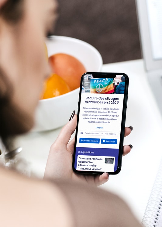
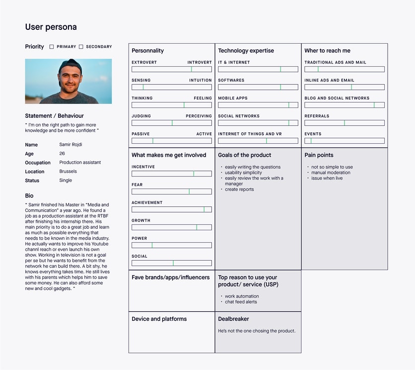
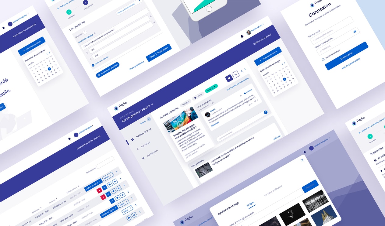
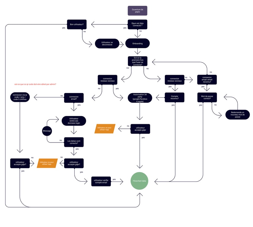
If we think it through, on a design perspective, Pepio is more than a survey app. Pepio is a mobile and a web app (for the end user) but also an admin platform where the buyers can create their surveys. We therefor have many personas, many flows, many design rules to take care of. And since everything needed to be done so quickly we had to cut some corners - no UX design everything was directly properly designed 😱
Never finished, always evolving
Obviously, after several months of design and development feedbacks and new features are added.
